


Client: Telegraph Road Entertainment / Role: Creative Director / Retail Partner: Costco Canada / Industry: Educational Publishing
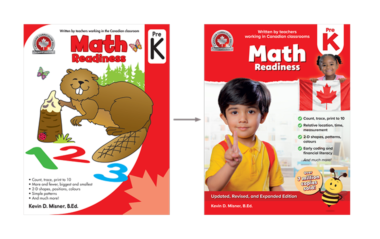
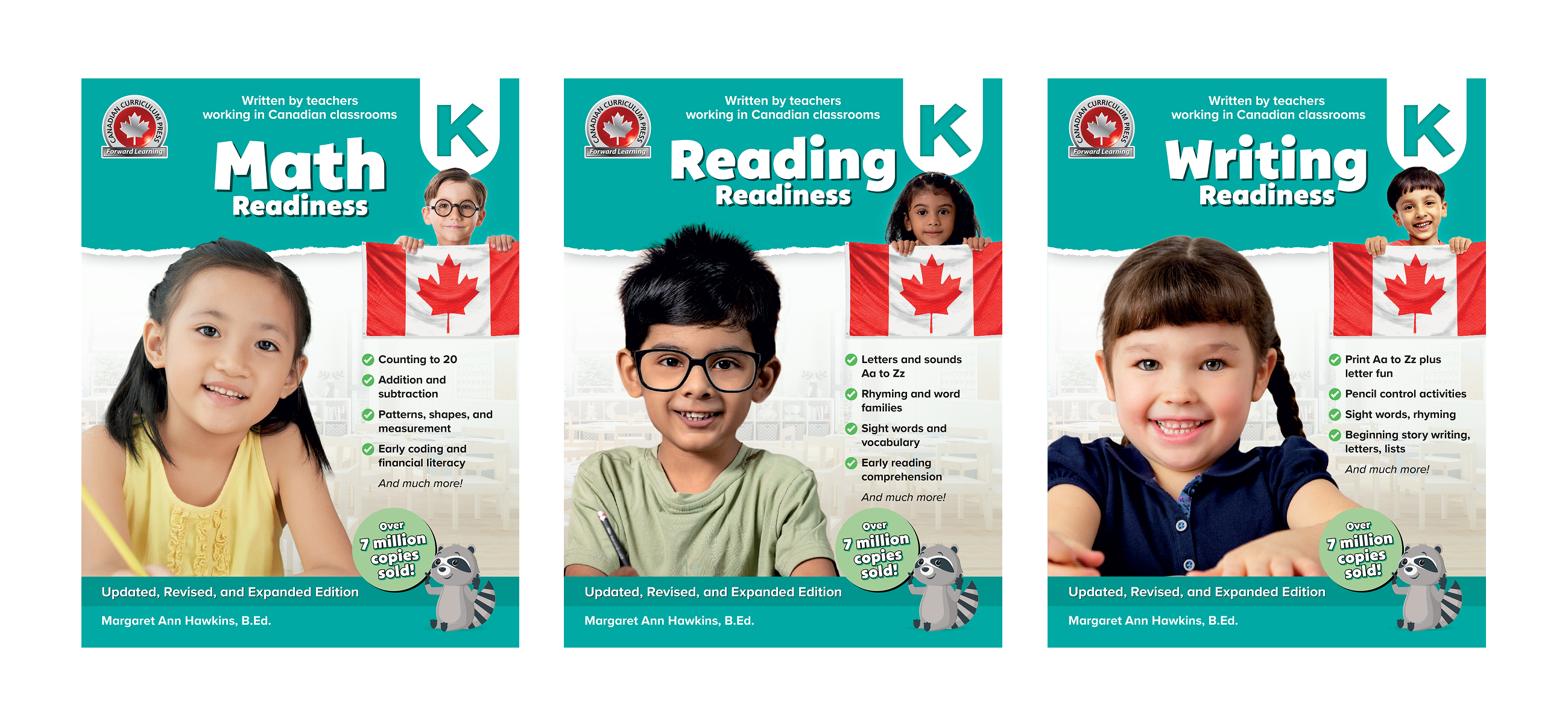
Canadian Curriculum Press is a bestselling Canadian educational workbook series spanning Pre-K to Grade 2 across math, reading, and writing. The series had sold over 7 million copies — but the visual system behind it hadn't kept pace. Illustrations were inconsistent clipart-era artwork, characters lacked diversity, layouts varied between titles, and years of reactive production fixes had accumulated into visual errors and inconsistencies.
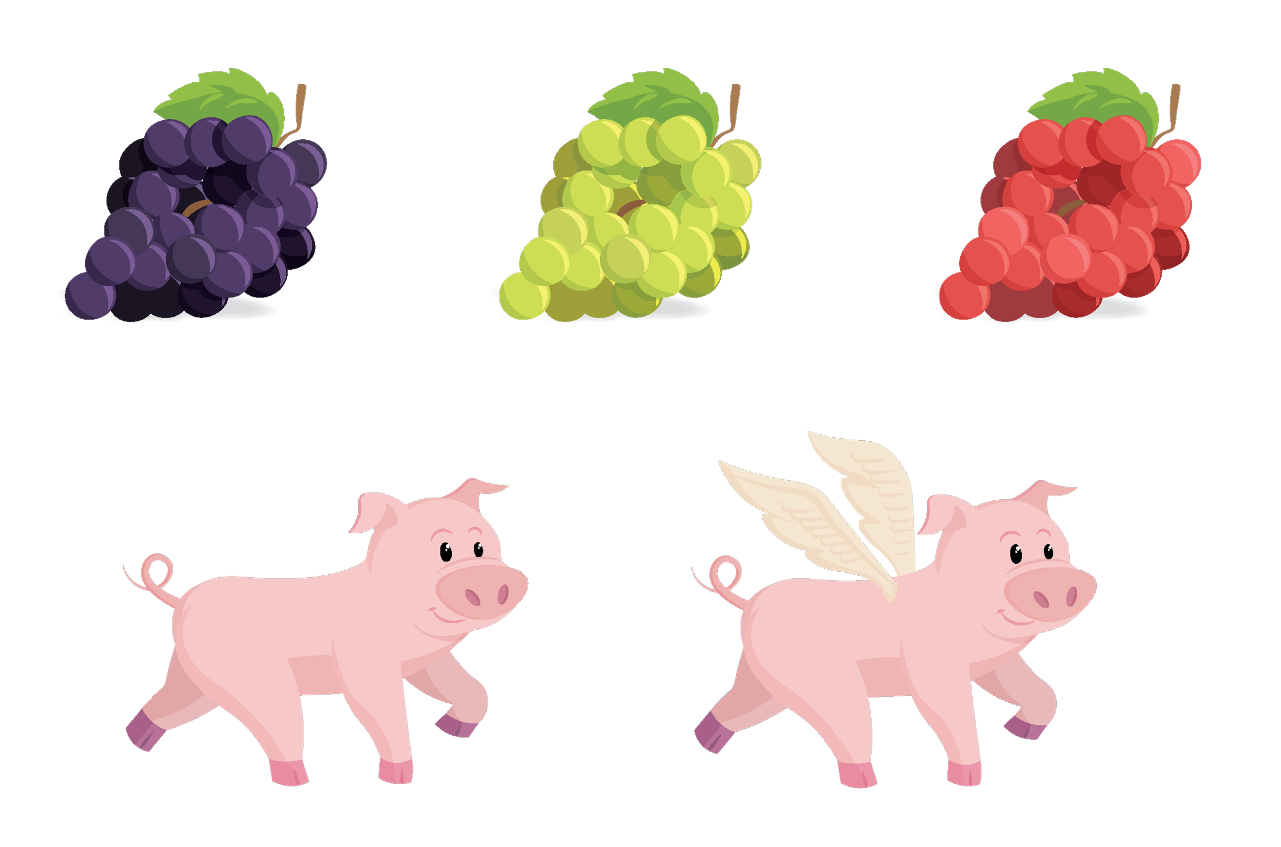
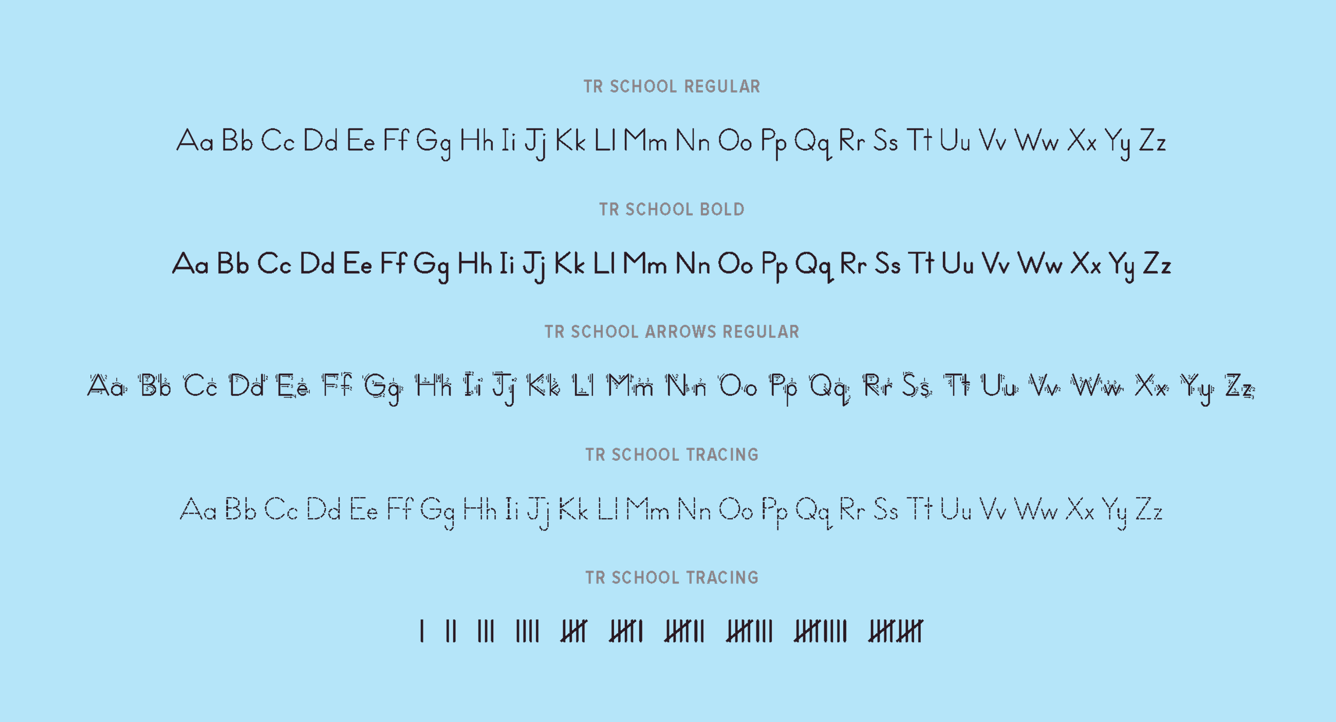
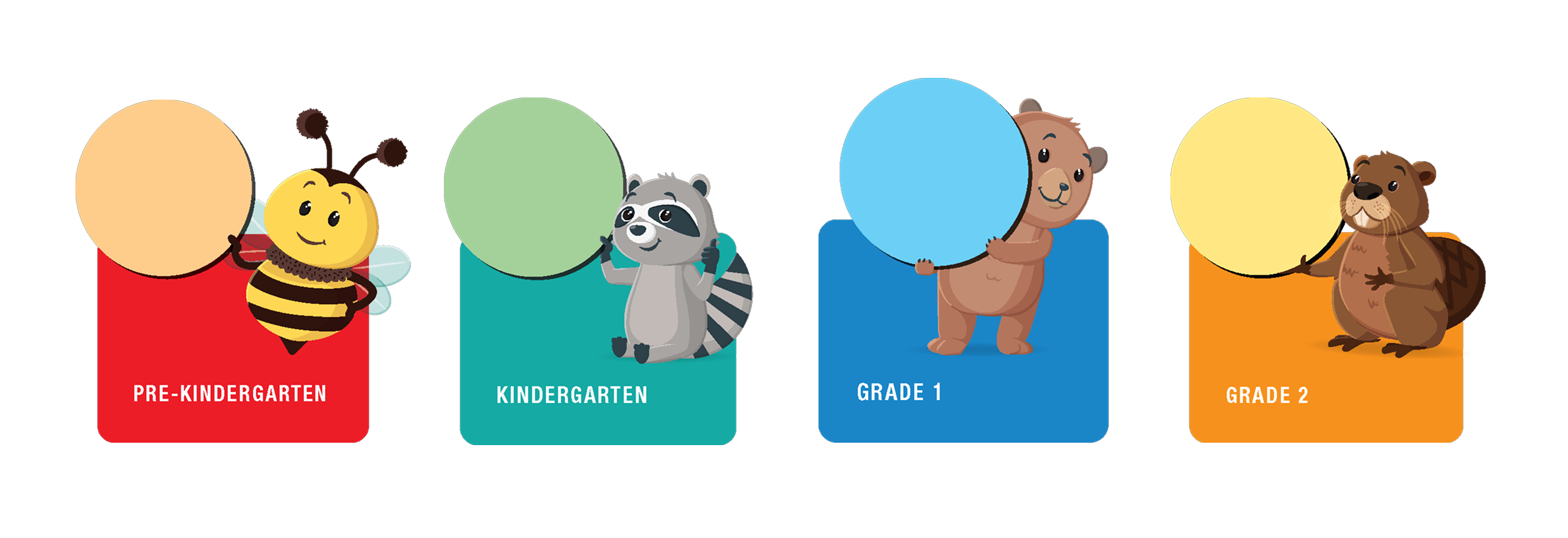
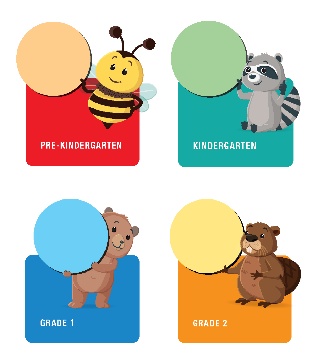
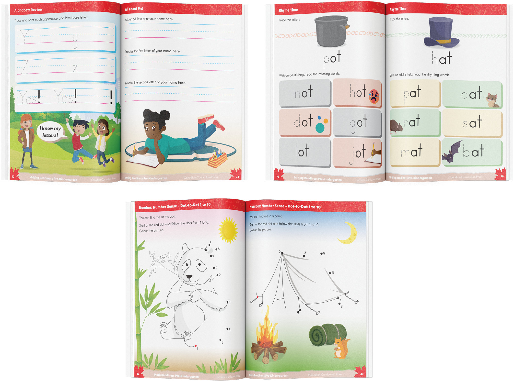
I led a full visual system refresh across 12 titles, managing the project from discovery through delivery: directing a team to create a 300+ asset inclusive character library with layered architecture for easy changes; establishing a grade-level identification system using colour and mascots; developing standardized interior templates and style sheets to ensure consistency across all titles; and commissioning TR School — a custom typeface family built to Canadian curriculum letter formation standards. I also planned and facilitated focus groups with teachers and parents — synthesizing their feedback into actionable design decisions that directly shaped the final cover design to maximize purchase conversion.
The refresh delivered a cohesive, inclusive and modern system across 12 titles. Clearer layouts and standardized templates made future production more efficient and consistent. Retailers responded with grade-level bundle kit requests, and the series won full pallet placement at Costco — one of the highest-volume retail commitments in the Canadian market.