


Client: Sacréh / Role: Brand, packaging, copy, and photography / Industry: Specialty Tea
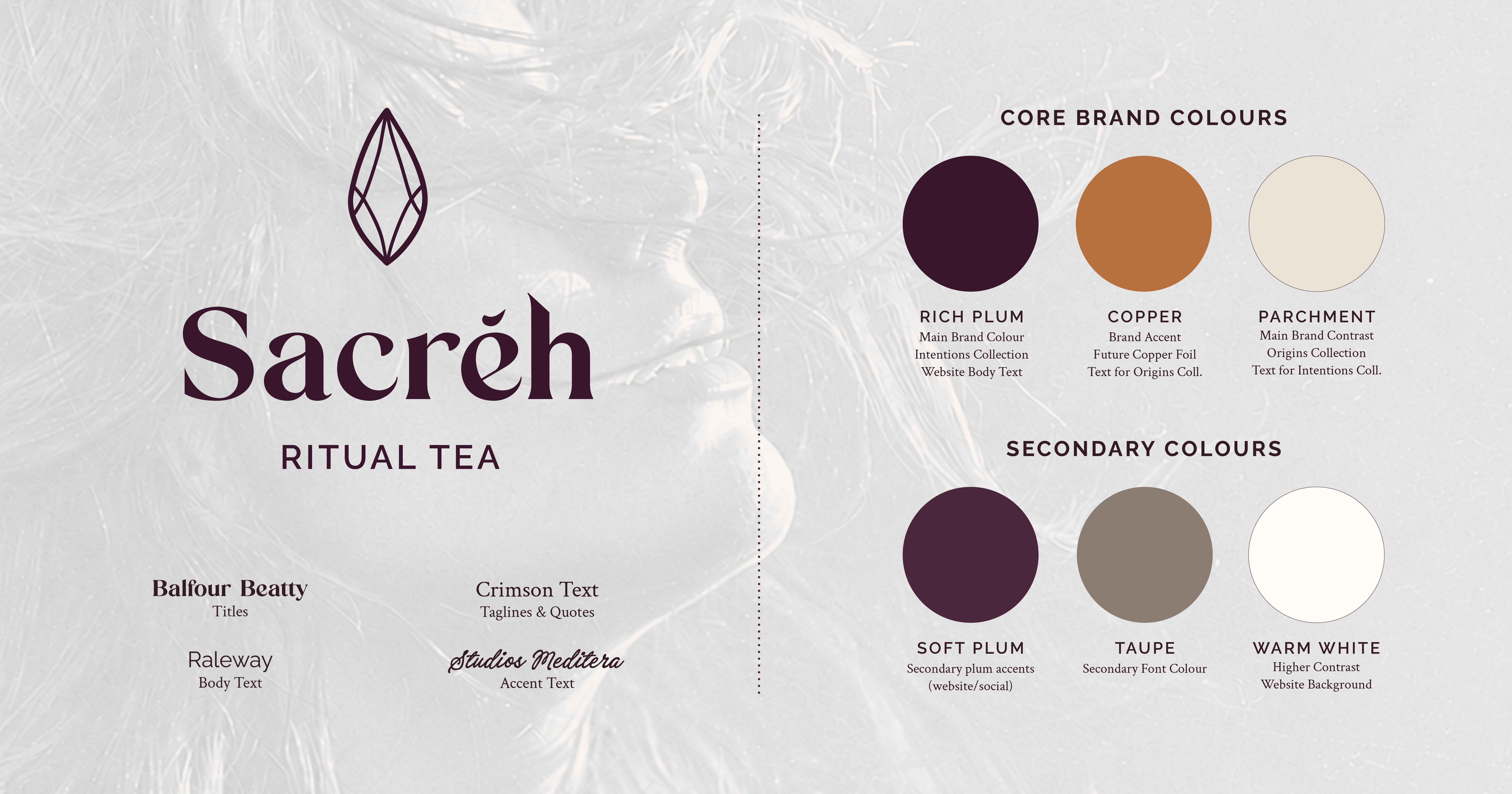
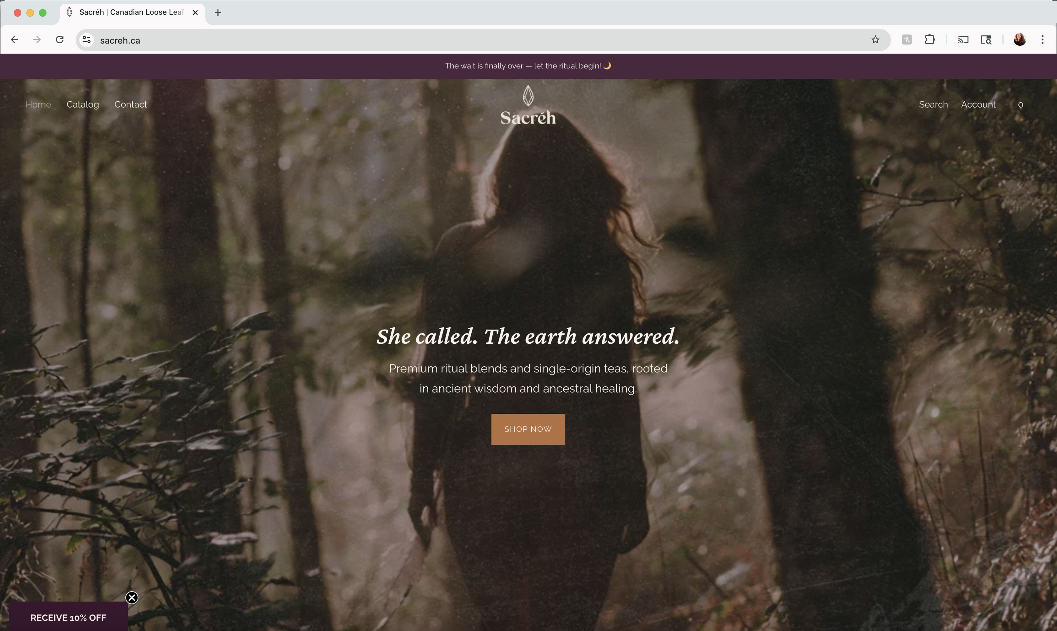
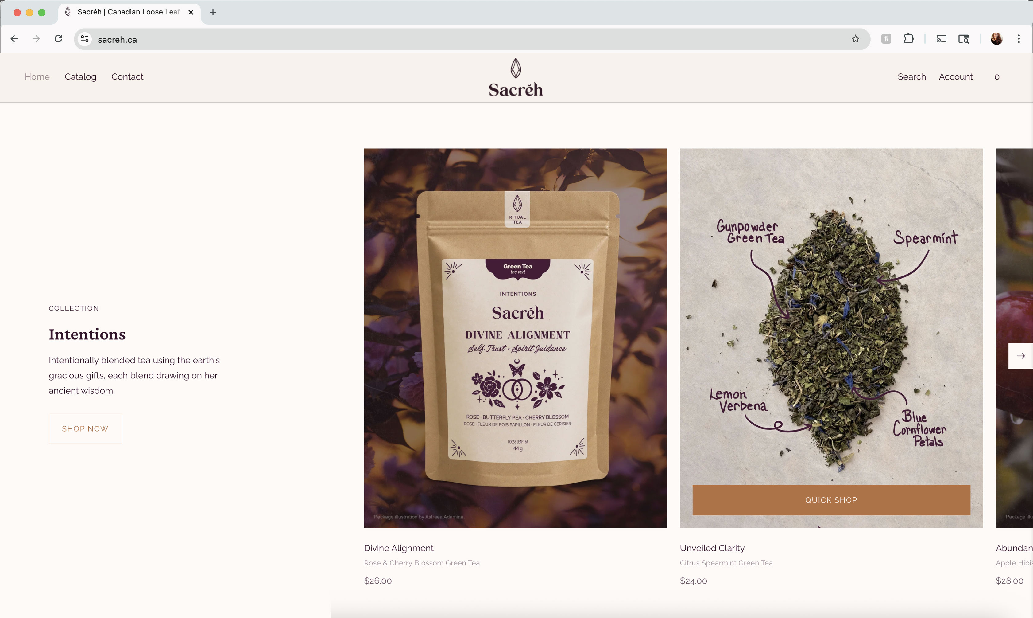
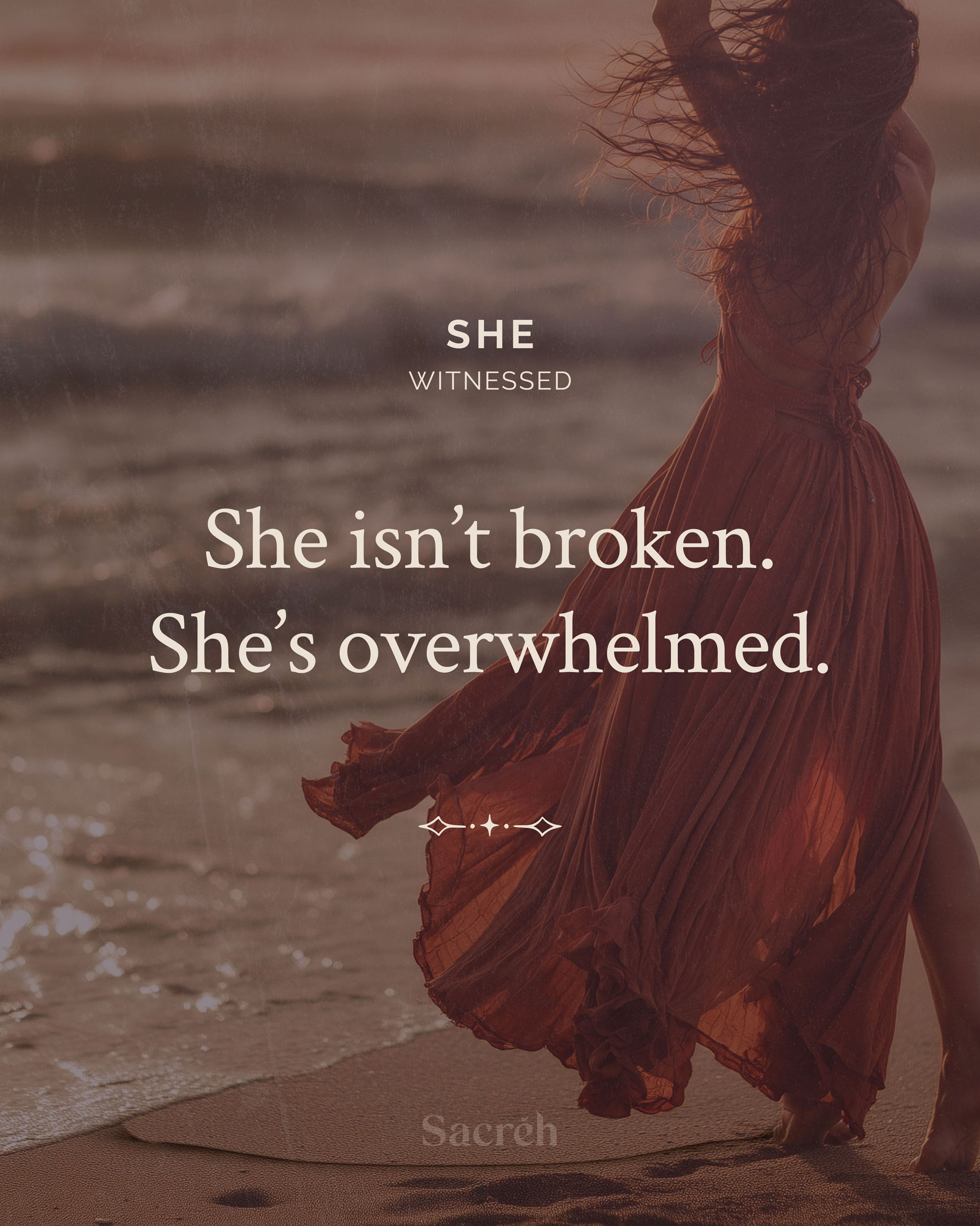
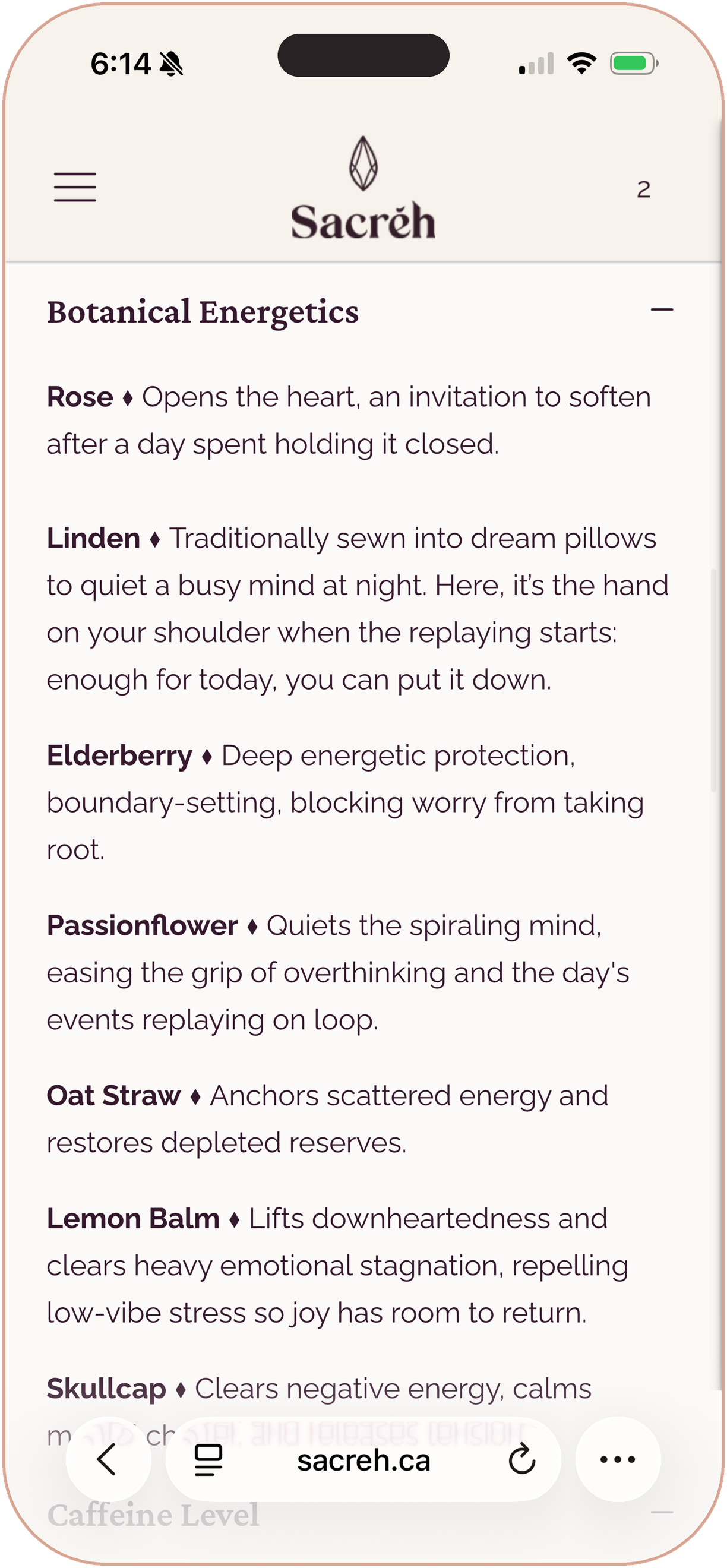
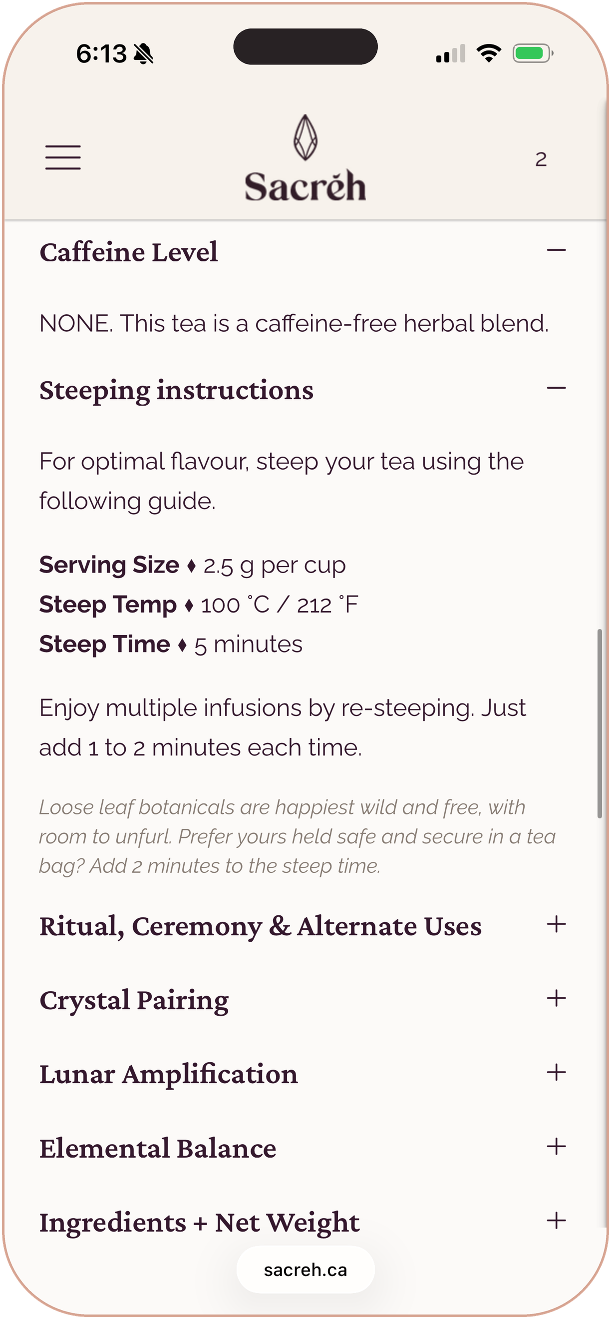
Sacréh is a premium ritual tea brand where every blend starts with an intention, not an ingredient list. My work was to carry that idea through how the brand looks, reads, and feels: the identity, the packaging, the copy, and the product photography.
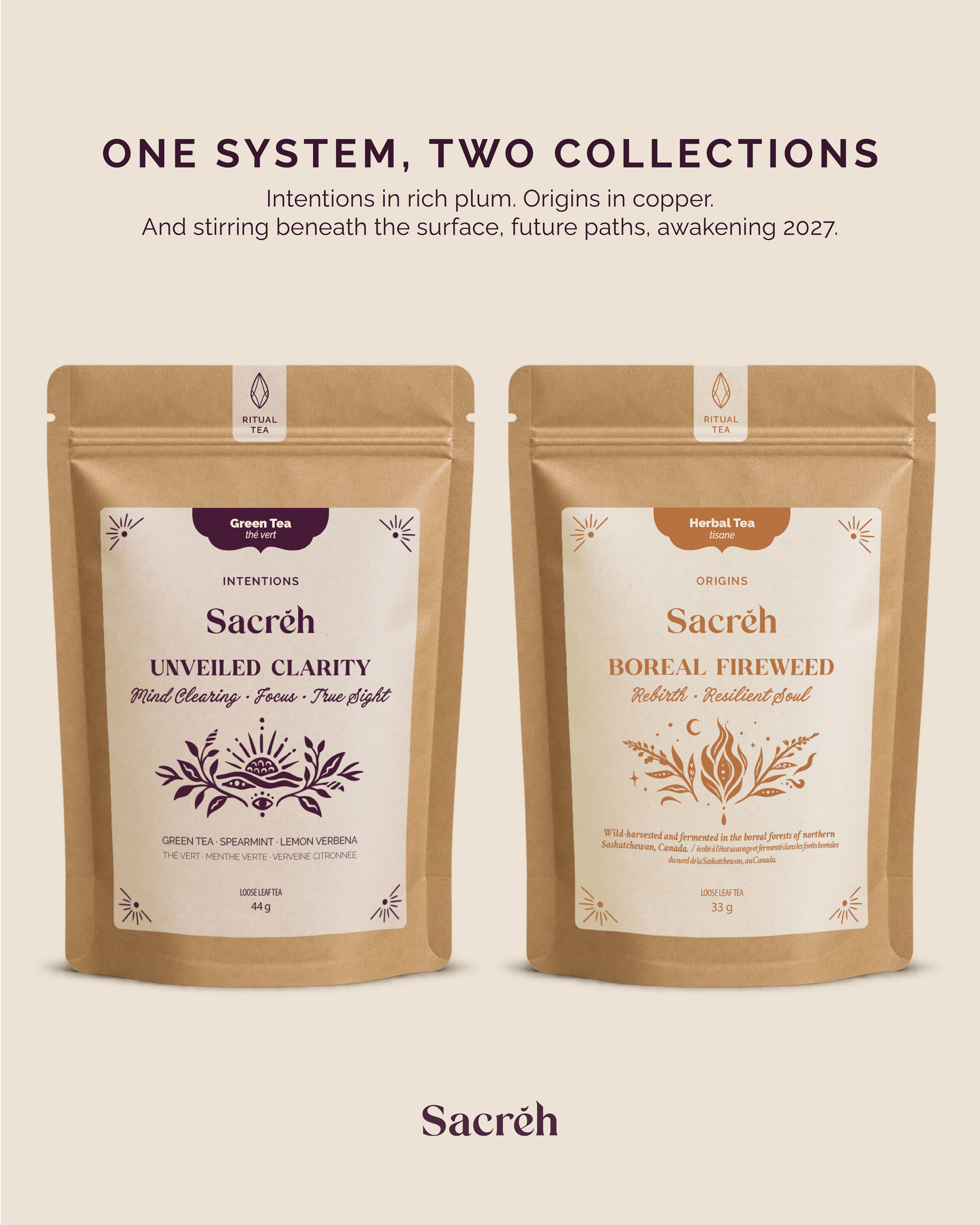
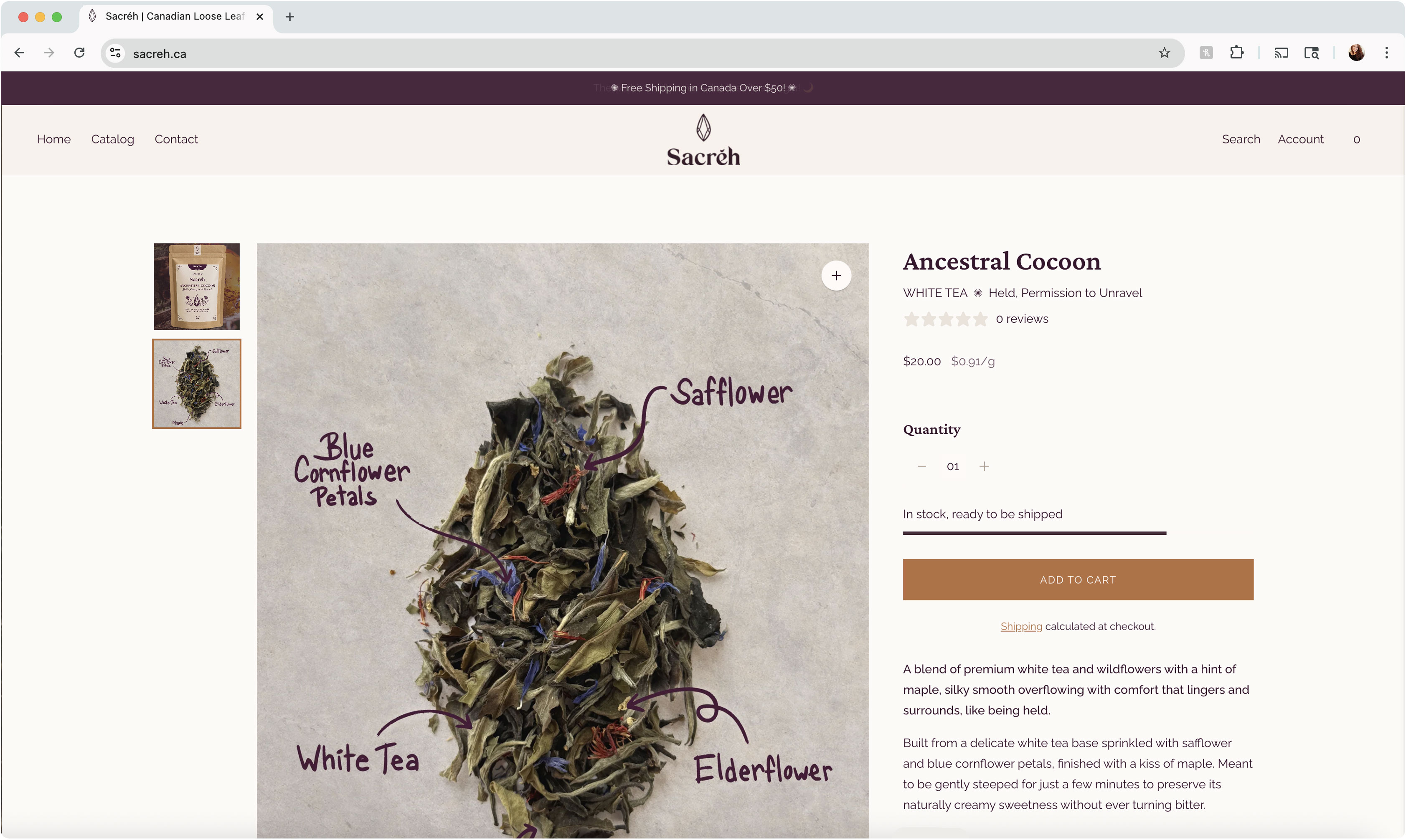
The range begins with two collections, Intentions and Origins, with Seasons and Womb to follow. Each blend carries its own hand-drawn, linocut-inspired illustration, built from symbolism, emotion, and botanicals to reflect its purpose, and I brought them into a single label system across the range. The labels keep things quiet and tactile: a single ink on cream, plum for Intentions and copper for Origins, printed in-house on kraft pouches. I styled, photographed, and edited custom photography of the real loose leaf product.
A consistent, recognizable brand across 10 blends and two collections, printed in-house and built with room to grow into future collections like Seasons and Womb. Early customer feedback has been warm, with the packaging admired alongside the tea.


